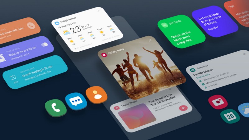
Focus on what matters, the moto said. Great but why did you turn a perfectly functional interface into a cheap iPhone clone? I was an iPhone XS user for 4 months until I decided to go back to Android as I owned the Galaxy S8 before getting the XS. Sold my old iPhone 7 and bought the Galaxy S9. Great, now I’m back or so I thought. Upon booting the phone I immediately was greeted with the new One UI and hated the experience ever since.
My problem is not just with the way the new icons look but as the os in general. I love minimalism and flat design but there is a difference between a reasonable UI and a toy like interface designed by a 5 year old. The icons look comical. The previous version had a balance between flat and modern design. Not anymore. The rounded notification boxes look out of place and shape.
The whole interface looks like LEGO. I do however like the control center and it looks a lot cleaner now. Other than that? Not so much. From the looks of things, Samsung is trying to turn the Galaxy lineup into an iPhone. If I wanted a phone to look like an iPhone I would go back to using my iPhone XS.
I get that they want to attract iPhone users to switch but that’s not the way to do it. At least give us an option for the old theme in the wallpapers menu. Love the phone and features but not this update. Thank you for the Pie Samsung.
